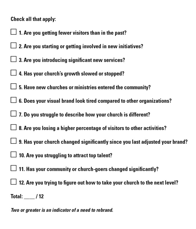
twelve common indicators that your church's brand may no longer be doing its job.
So how do you know that it’s time to rebrand? What warning signs might you look for? Here is a list of
twelve common indicators that your church's brand may no longer be doing its job.
0 Comments
On my way to church yesterday I saw a sign in the median for another church. It was a simple sandwich board with the logo, service times and location. My initial thought was "I wonder how many people will check out that church just based on that informational sign?" My second thought was "They are giving that logo a lot of responsibility." The focus of this post is based on my first thought rather than my second, but just a side-bar on my second thought:
This is exactly why a well thought-out logo is so important, sometimes it will be the only thing that conveys your church's personality. However, it's good to keep in mind that rarely will people explore your church, or even more rarely, come to Christ just on a logo alone. But it is a very important aspect of your brand. So back to my first thought... I understand that the sign builds awareness and is there for when people decide they want to find a church. But this doesn't mean it can't have some personality, especially when there are 3 other churches in the area doing the same thing, sometimes right next to the other. Anyway, here would be some of my ideas for injecting some personality: 1) Add People: Since churches will most likely have several signs placed around the community, add a different image of people on each sign. Specifically images of people that portray the type of community you are (college students, young adults, young families, different ethnicities, etc.) More than likely drivers will pass a couple of your signs, so they'll see what type of church environment you have (hopefully it's one that they relate to). 2) Add Phrases: What if, instead of leading with basic information have in large font "Hi, Que Pasa, Howdy, Look at me, I'm a sign in the median..." These simple phrases go a long way in giving your church a personality and will resonate more than just a logo and service times. 3) Be WAY different: Venture beyond a sandwich board. Put a box or arrows around a telephone pole, make a custom sign/shape or use objects that relate to your church's name or image—if your church name has something to do with water, use some old canoes or paddles to hold your signs. Yes, these ideas range in cost and effort, but I always say "I'd rather have 3 signs that get the community talking rather than 16 that they don't say anything about." Recently I learned about a style of art known as "Steampunk." I've actually always been drawn to this style (you'd know if you saw my watches or the clock in my house). However, I didn't know it had a name. Even more, I didn't know it was created by artists with such a specific achievement or end-result in mind.
To para-phrase, this style of art is based in Victorian era Britain where steam power is still widely used. Elements of technology or futuristic innovations are added to various Victorian-era items. But not innovations as we know them today, these are innovations as Victorians may have envisioned them. I've included a picture to illustrate, but think H.G. Wells or Jules Verne. What got me thinking was that this idea isn't far off from how many organizations brand, market and communicate—applying strategies that, to them, seem innovative but are very far off from being successful. The major downfall is that these ideas not only fall short of connecting with people they often paint a more out-dated and out-of-touch picture of the organization. Simple elements like design, wording, symbols and application can convey a great deal about your organization to your audience— especially how in touch you are with what's important to them or relevant in today's world. The simplicity of a logo (mark, type and tagline) can, in a matter of seconds, shape an individual's perceptions of your organization (both consciously and sub-consciously). And to think how many times a logo or branding in general falls from the priority list. But unlike Jules Verne who didn't mind if his whimsical, over-weight Zeppelin or analog computer ever worked, your organization is relying on effective branding and marketing to convey a particular message/personality that, in turn, will connect with your audience. If you notice signs that your organization is having an issue with branding or marketing, contact Brand Army or your nearest branding professional—an ounce of prevention is worth a pound of cure :-) Before you judge the ridiculousness of these commercials, the Old Spice ad agency is gaining respect in the industry and winning various awards for producing commercials that break the mold. I know, you might say that these explode the mold and do a horrible job of promoting the product. However, I think there's something to be said for totally random marketing. I mean, at the end of the day I enjoyed it so much I reposted it. As I strategize ways to help churches engage the communities around them, I might keep something like this in my back pocket. I would bet money that if someone came across a direct-mail postcard with a half-naked guy sitting on a human-lipped tiger they might pause and learn more about what's going on... |


 RSS Feed